
Tech Effect web3 infographic
Challenge & approach
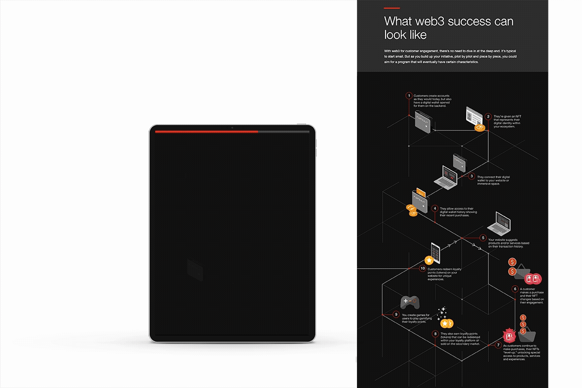
To help business leaders understand the evolving stages of web3 customer engagement within PwC’s flagship Tech Effect digital hub, I designed and built an interactive infographic that visually maps key stages of the customer journey. Subtle, responsive motion and scroll-triggered interactions enhance the narrative while maintaining clarity.
Result
The interactive infographic supports understanding through visual storytelling rather than text-heavy content. The result is an intuitive digital experience that makes web3 concepts accessible, engaging, and fun to explore.